MADÉ Journal
What Makes a Brand Feel Premium? It’s Not the Budget
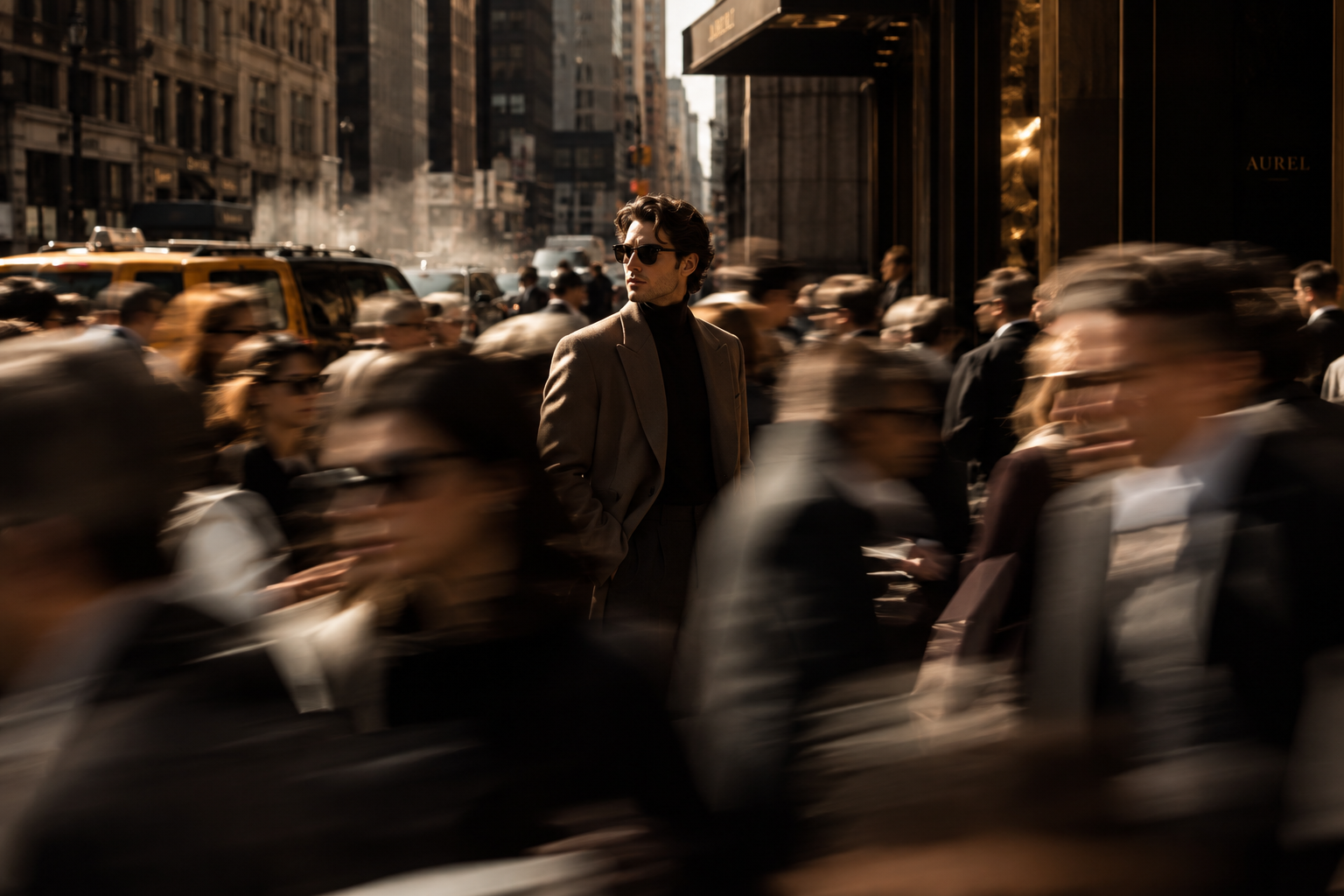
There is a particular feeling you get when you encounter a premium brand.
Before you know the price, before you read the About page, sometimes before you even understand exactly what the company sells, you sense that the brand is considered.
The photography feels intentional. The language doesn't try too hard. The website gives things room to breathe. The packaging, typography, social content and smallest details seem to belong to the same world.
And we tend to assume this feeling is expensive to create.
Sometimes it is. Beautiful production, custom packaging and ambitious campaigns obviously require investment.
But money alone doesn't create premiumness.
Premium is, first and foremost, a perception.
And perception is built through hundreds of signals: what a brand chooses, what it repeats, what it refuses to do and how consistently it communicates its point of view.
For emerging brands, this matters. You may not have the budget of an established luxury house, but you can still understand, and deliberately design, the signals that make a brand feel more valuable.
Premium starts with clarity, not aesthetics
One of the most common mistakes brands make when trying to appear more premium is starting with the surface.
Make the logo more minimal. Use serif typography. Introduce beige. Add more whitespace.
Suddenly, everything is “luxury.”
Except it isn't.
These visual codes can work beautifully, but they are not what creates premium perception on their own. In fact, when too many brands borrow the same visual language, the attempt to look sophisticated can make them almost indistinguishable.
Before asking How should we look?, a brand needs to answer more fundamental questions.
Who are we for? What do we want to be known for? What do we believe? What should someone feel when they encounter us? What makes our perspective different from the dozens of alternatives available to them?
And perhaps most importantly:
What should people recognize before they even see our logo?
A premium brand doesn't need to shout to be noticed. But it does need to be precise enough to be recognized.
That precision comes from knowing exactly who you are speaking to and what matters to them. The goal isn't to attract everyone. It is to create something distinctive and relevant enough that the right people notice, remember and choose you.
Without that clarity, premium branding becomes decoration.
With it, aesthetics become expression.
Silence can be a form of luxury
Once a brand knows who it is, it doesn't need to constantly prove it.
This is where restraint becomes powerful.
Not every empty space needs another message. Not every post needs five selling points. Not every campaign needs to explain everything. Not every trend deserves participation.
In branding, silence can be a form of luxury.
When every brand is competing to be louder, the brand that knows when to be quiet can feel more confident.
Think about the difference between a storefront covered in promotional messages and one displaying a single product beautifully.
One says: Please notice everything.
The other says: This is worth noticing.
But silence only works when there is something distinctive behind it.
A generic brand that simply removes things can disappear. A clear, recognizable brand can use restraint because its identity is already doing the work.
That is the difference between being quiet and being invisible.
Premium brands don't necessarily demand attention.
They create enough distinction that attention comes to them.
Consistency creates perceived value
People don't experience a brand through a strategy presentation. They experience fragments of it: an Instagram post, a product page, packaging, an email, a menu, a physical space.
When those fragments feel connected, the brand feels considered.
The photography shares a visual language. The copy sounds like the same person speaking. The colours, typography and compositions follow a recognizable logic. The website and social presence belong to the same universe.
Over time, customers begin to recognize the brand without needing to see its name.
That recognition creates memory, and memory builds brand value.
Premium brands rarely feel accidental.
Creative direction turns a brand into a world
Brand identity gives you the ingredients.
Creative direction determines how those ingredients live in the real world.
This is where many emerging brands lose the premium feeling they established during branding.
They have a beautiful logo, colours and typography, but every photoshoot looks different. Social content follows one aesthetic, the website another, and campaigns change according to whatever is trending.
The result can be attractive without being recognizable.
Creative direction creates continuity. It defines how the brand uses photography, light, movement, styling, locations, textures and composition.
The goal isn't for everything to look identical.
The goal is for everything to feel related.
This is particularly important in fashion, beauty, hospitality and lifestyle, where people aren't only buying functionality. They're also buying taste, identity, atmosphere, aspiration and belonging.
A recognizable brand world gives them something to enter.
Specificity feels more premium than generic beauty
A brand can have elegant typography, neutral colours and beautiful photography and still be completely forgettable.
Why?
Because looking good and being distinctive are not the same thing.
Premium brands tend to have specific tastes.
Perhaps the photography is unusually intimate. Perhaps the typography is unexpected. Perhaps the writing is exceptionally understated. Perhaps campaigns repeatedly explore a particular visual or cultural territory.
These choices become part of the brand's identity.
So instead of only asking:
Does this look good?
Ask:
Could this belong to anyone else?
Good creative direction doesn't require an enormous production budget
Photography has a major influence on perceived value, but expensive equipment and elaborate locations aren't the same thing as good creative direction.
A simple shoot can feel elevated when the concept is strong.
Light, framing, crop, negative space, movement, styling and composition can completely change how an image feels, without dramatically changing the production budget.
A beautiful location cannot rescue an unclear idea.
Premium imagery starts before the camera appears.
The same applies to typography. You don't necessarily need an expensive custom typeface. You need a thoughtful typographic system with clear hierarchy, spacing and rules.
The difference is not always how much was spent.
It is how carefully the decisions were made.
Premium brands don't need to keep saying they're premium
Language can elevate a brand, or undermine it.
“Premium.”
“Exclusive.”
“Luxurious.”
“High quality.”
When brands repeatedly need to tell customers how sophisticated they are, the claim can start to feel less convincing.
Strong brands demonstrate value through specificity.
Instead of saying a product is exceptional, explain the detail that makes it exceptional. Instead of announcing exclusivity, create genuine selectivity. Instead of describing the brand as sophisticated, develop a voice that actually feels sophisticated.
This is another form of restraint.
The strongest positioning is often experienced before it is stated.
Don't imitate luxury. Build your own codes.
Minimalism is not inherently premium.
Neither are black packaging, serif typography, muted photography or gold foil.
The more useful question is:
What are our brand codes?
These are the recurring colours, typography, imagery, compositions, phrases, symbols, materials or styling choices that help people recognize you.
They become powerful through repetition.
Instead of making every campaign look completely new, create variations within a recognizable universe.
Novelty gets attention.
Recognition builds brands.
You need both.
Where should a smaller brand spend its budget?
If resources are limited, don't try to make every touchpoint spectacular.
Prioritize the decisions that influence everything else.
Start with clear positioning and brand strategy. Establish a strong visual identity. Create a creative direction that can generate many executions rather than one beautiful campaign. Then identify the customer touchpoints where perception is formed most strongly.
For a beauty brand, that might be packaging, product photography and the website. For fashion, campaign imagery, styling and e-commerce. For hospitality, the physical environment, photography, menus and social presence.
The objective isn't to distribute a small budget evenly.
It is to understand where perception is actually being formed and concentrate creative attention there.
Premium is not an aesthetic. It is a standard.
The most useful shift is to stop thinking of premium as a particular look.
It is not beige.
It is not minimalism.
It is not a certain typeface, packaging finish or photography style.
Premium is the perception that someone cared enough to make deliberate choices — and cared enough to maintain them.
Sometimes that confidence is expressed through what a brand adds.
And sometimes, through what it has the confidence to leave unsaid.
The aesthetic can change. The principle doesn't.
Clarity. Consistency. Specificity. Restraint. Distinctiveness. Attention.
For brands without enormous budgets, this is good news.
You don't need to compete with the production spending of global luxury brands. You need to become exceptionally clear about the world your brand belongs to — and disciplined about how you build it.
At MADÉ Creative Studio, this is how we think about branding and creative direction: not as a collection of assets, but as a system for shaping perception.
silence is luxury.